Proudly Canadian, Power Play Poutine is a neighborhood staple where crispy fries, rich gravy, and mouth melting cheese curds bring people together. They’re the spot in town to gather around with family and friends as you enjoy a delicious meal, engulfed in the sports culture.
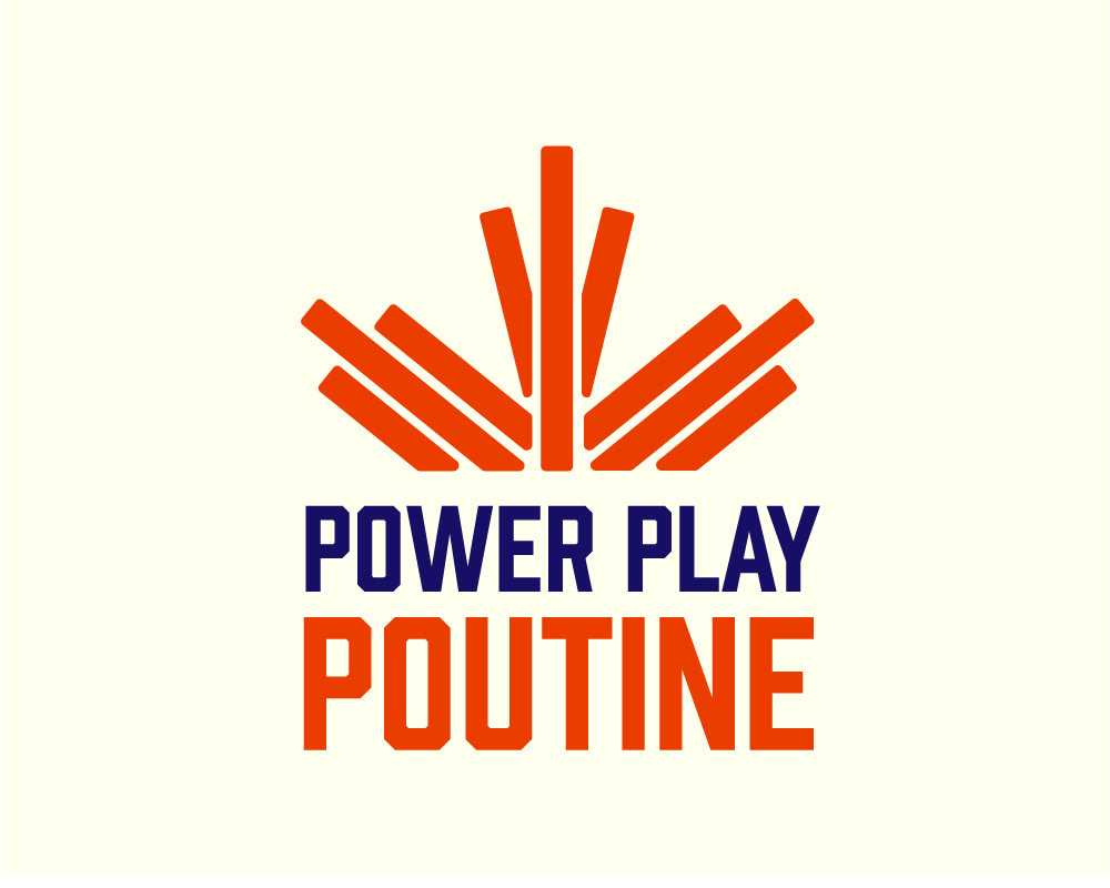
Logo
The logo is a culmination of our audience values and main product. The fries resembling the maple leaf were stacked on the wordmark for more optimal composition. The font Prohibition was utilized as it creates a hockey-like atmosphere without being too on the nose.
Colour
The red-orange psychologically evokes appetite and warmth that is associated with poutine. The navy blue helps ground the colour palette and creates contrast, it represents reliability and trustworthiness. Combined together these colours resemble hockey memorabilia, while most importantly targeting the human appetite.
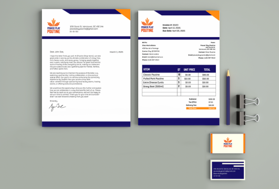
The stationary being the corporate aspect of the business I primarily used the navy blue to create the sense of trustworthiness and reliability. I used paper white instead of our brand's white as this would be much smoother in the printing process and display vital information more clearly.
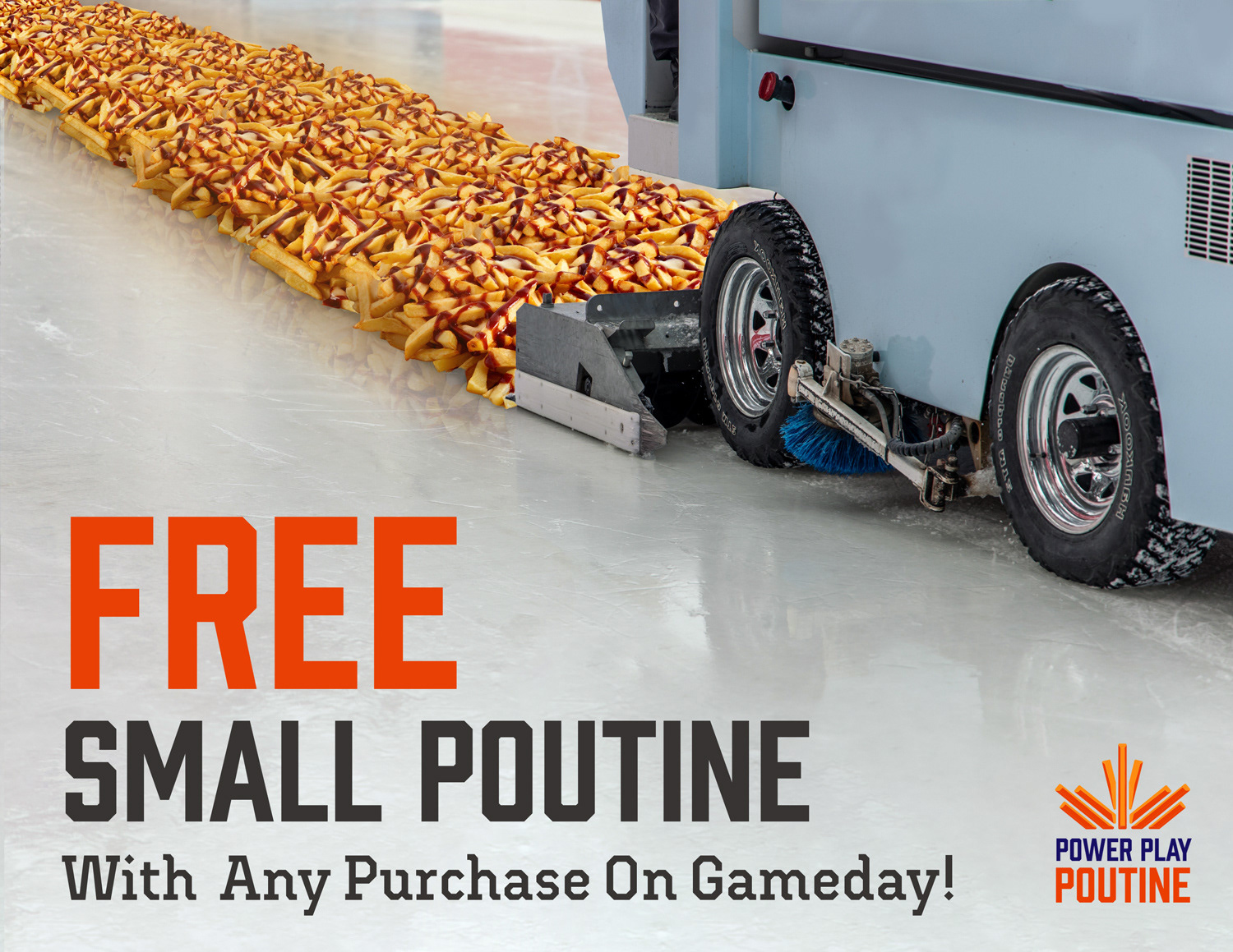
For the first Ad campaign I chose to go with an eye catching ad that plays into the absurd, while still connecting with the target audience. The zamboni and poutine are placed at an angle and guide you to the text. The text hierarchy is structured to lead your eyes through the composite. The deal is specifically highlighted to reel you in.

The second Ad campaign has been created to be a station ad, thus I was inspired to keep the visuals minimal, use bright demanding colours and were organized to resemble the layerings of poutine. The text curving down helps guide the audience to CTA, bringing in new potential customers.
I incorporated Canadian patriotism into my campaign, due to recent events it was the most efficient way to bring in new customers, as people are looking for Canadian businesses.
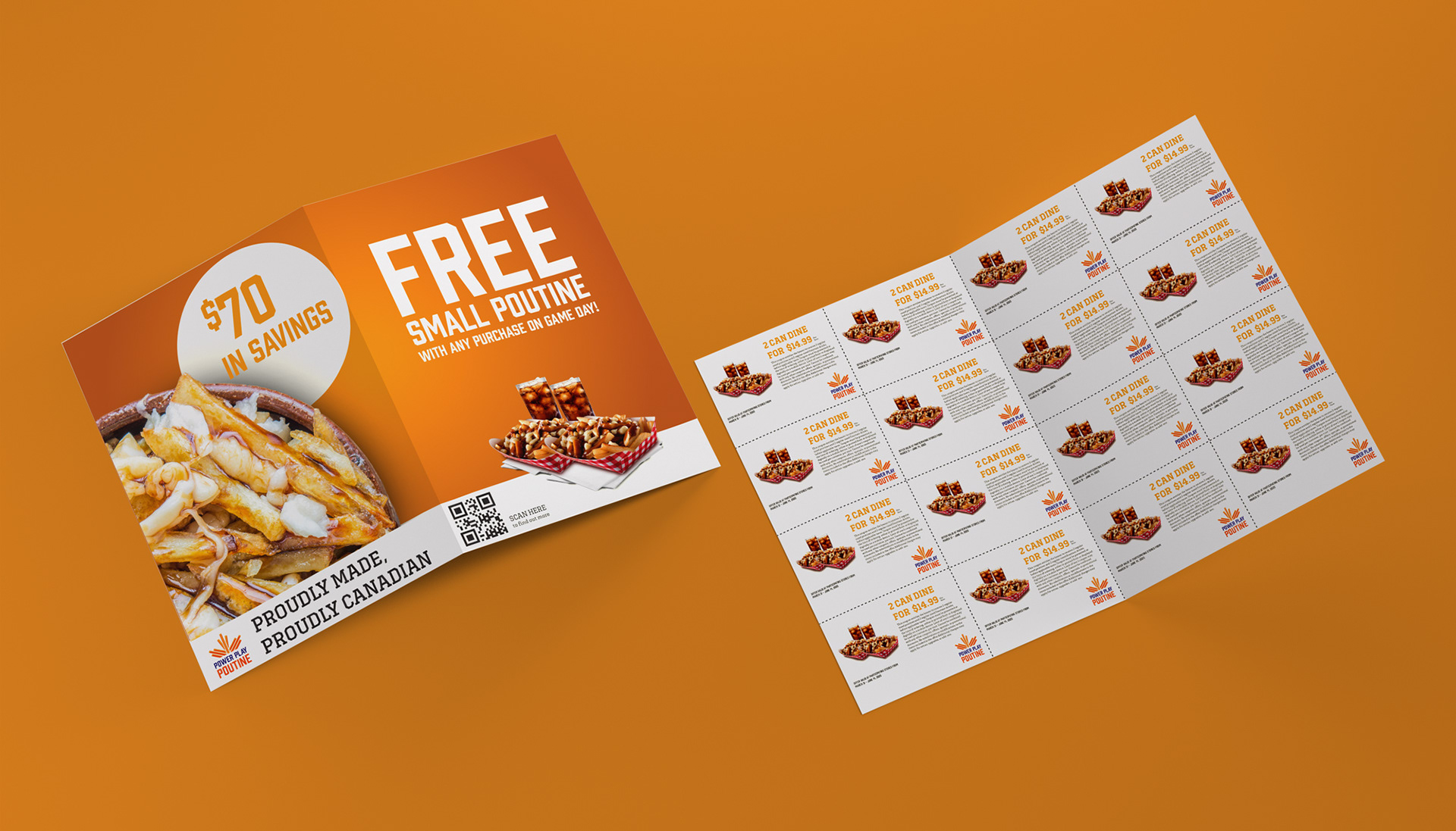
Power Play Poutine aims to be a neighborhood staple and there’s no better way to do this than to give them deals right at their front door. The orange gradient creates a sense of depth. I reinstate the deal and sense of patriotism to better connect with a more general audience. I incorporated a QR code to send more traffic to the website.
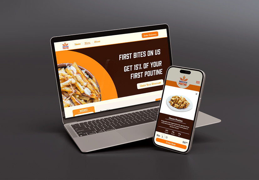
The website was overhauled with more modernized colours, improved hierarchy text, creating an items page, and placing images in the menu. I emphasized orange to create a sense of hunger as you navigate the website.