

The design is constructed to appear as a phoenix with a flame within its wing. The logo directly resembles the company name with the flame differentiating it from other birds to avoid confusion. The head feathers also act as a way to classify the logo as a phoenix as the upward curve is seen in Chinese depictions.
The use of circular and round curves represent the harmony, beauty and grace that is symbolized by the phoenix in China.

The rich red is symbolized as prosperity and renewal in Chinese culture. Exemplifying the refreshing change a person gains with a new tattoo and the quality, long lasting tattoos of our establishment

The typeface Gyst Variable was used as the quirky serifs and tails resemble the feathers of phoenix, it also brings along this sense of elegance that was fitting for the brand identity.
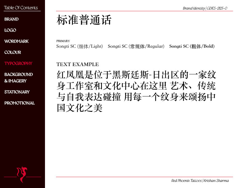
I chose Songti SC as the varying contrast created an ink like effect, which correlates with the industry Red Phoenix is apart of.
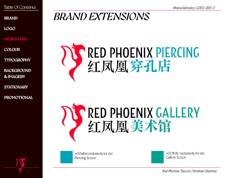
I was required to expand on the brand, for that I chose the piercing and gallery. The blue was used for piercing, as it resembles cleanliness and sterile equipment is often blue.
Green was utilized for the gallery sector, as in Chinese culture it symbolizes health and prosperity. And art is a form of expression that is able to sustain mental health.
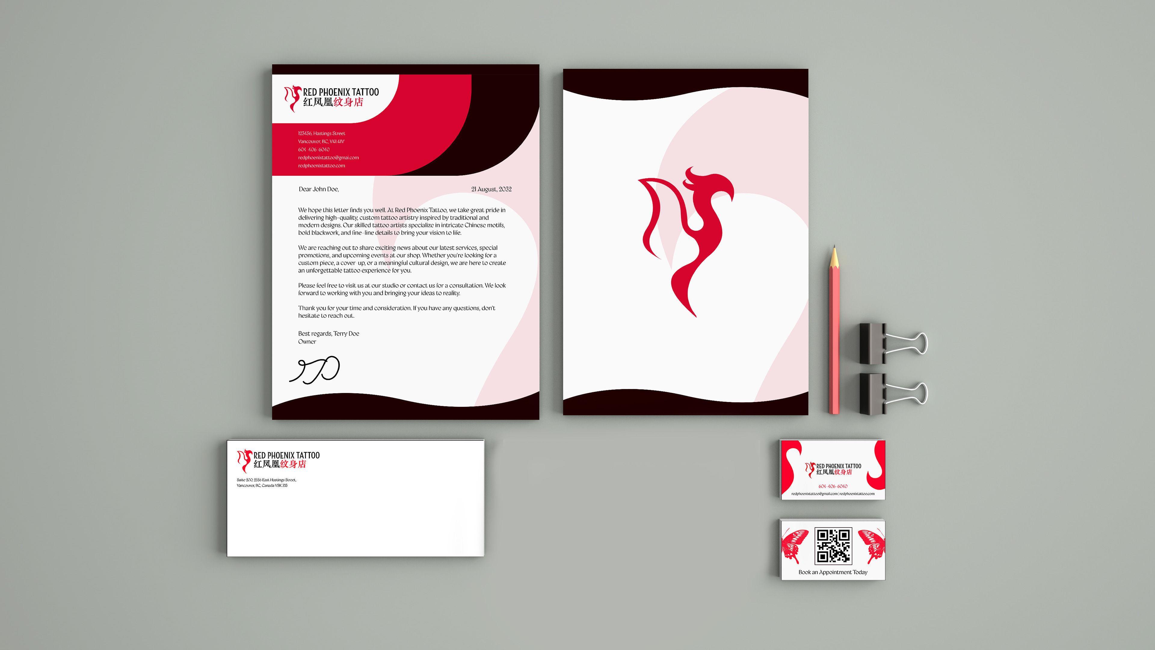
For stationary I used the brands graphic element of curves that resemble the tail of a phoenix. The business card I aimed to convey the services of the brand by having a tattoo print at the back, to give the illusion the card had been printed.
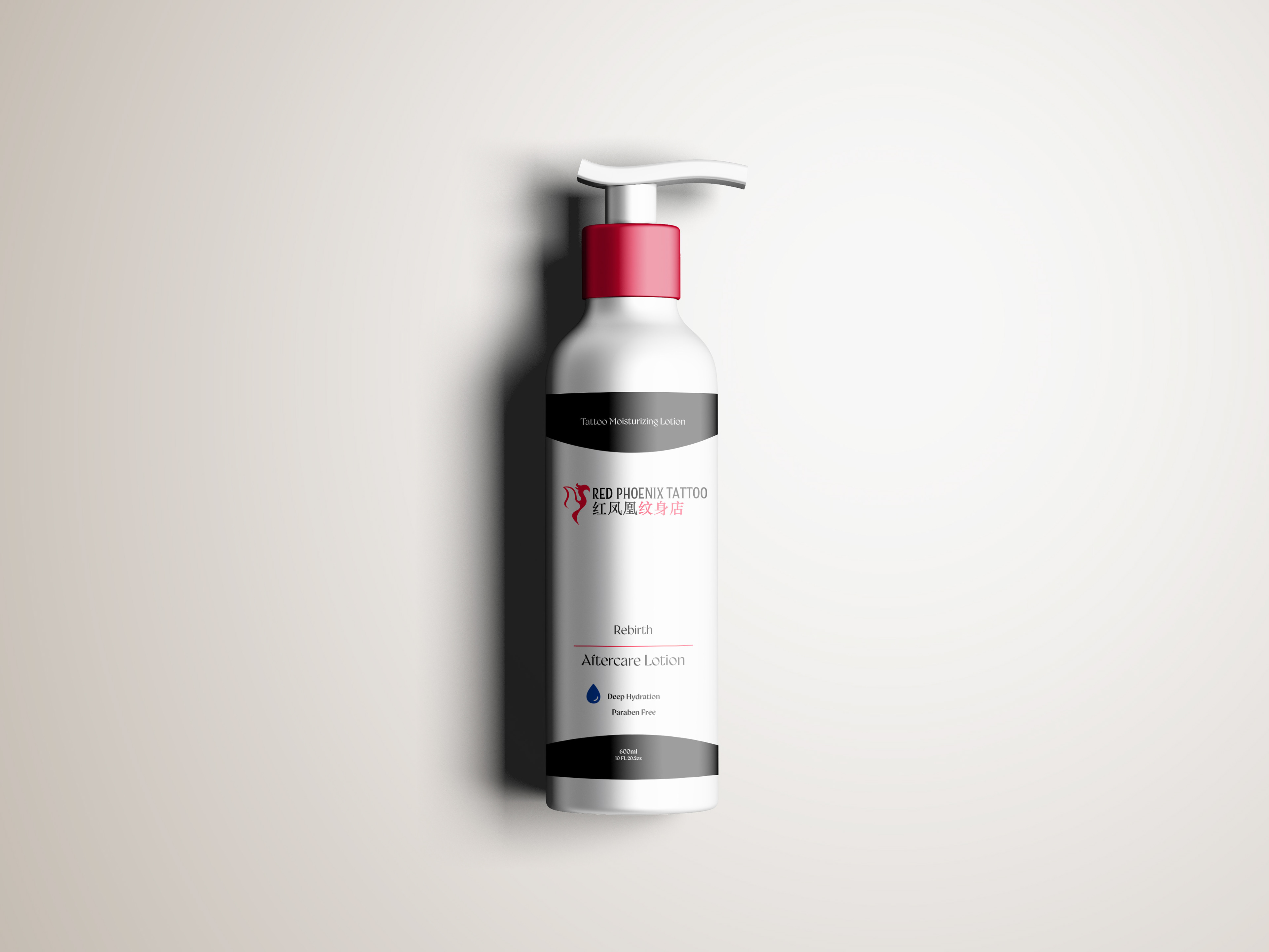

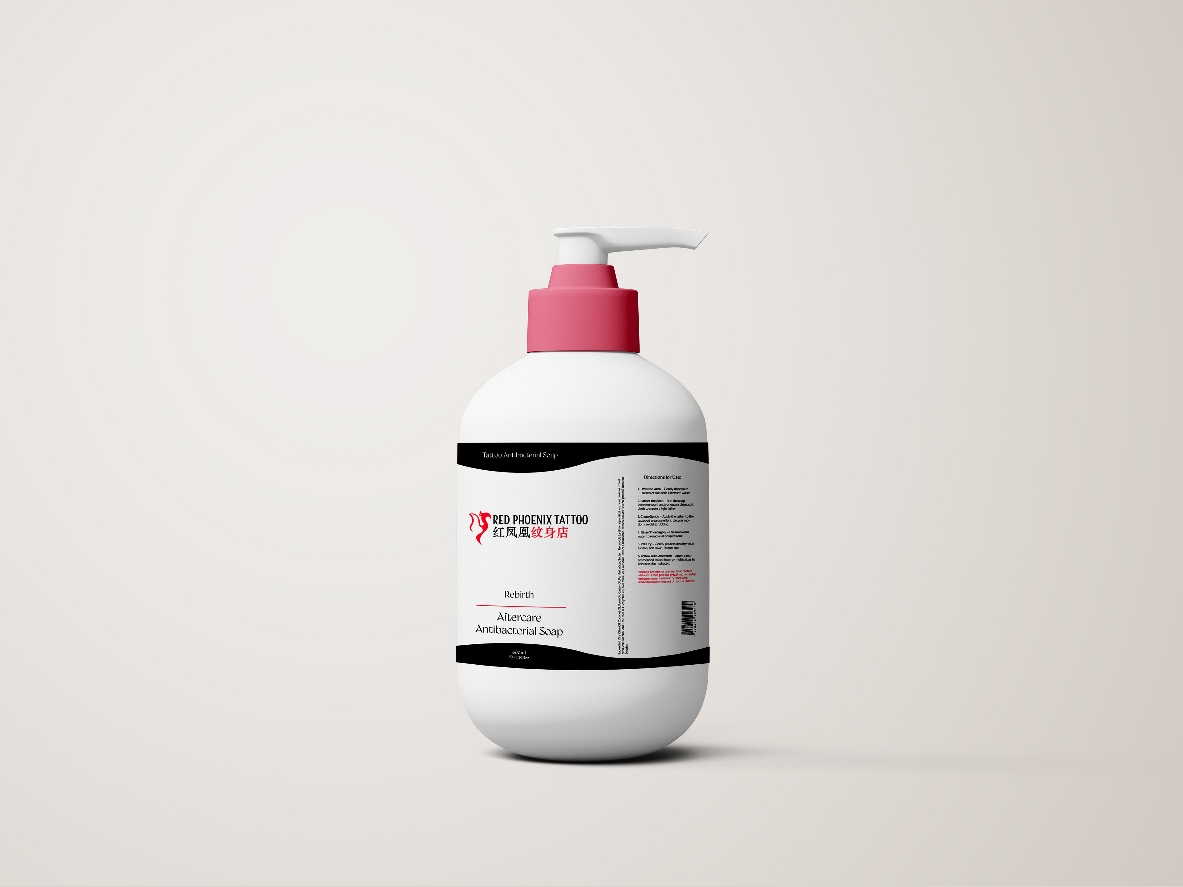
The Rebirth line was created to further develop brand image. Customers would leave the studio with all the products they required to take care of their tattoo.
I chose the name Rebirth as the Phoenix in myth represents renewal and being born anew, and these products help revitalize your skin and replace damaged skin cells.
Due to red being a vital part of the colour scheme I went with a minimalist design, as black and white better convey cleanliness.