
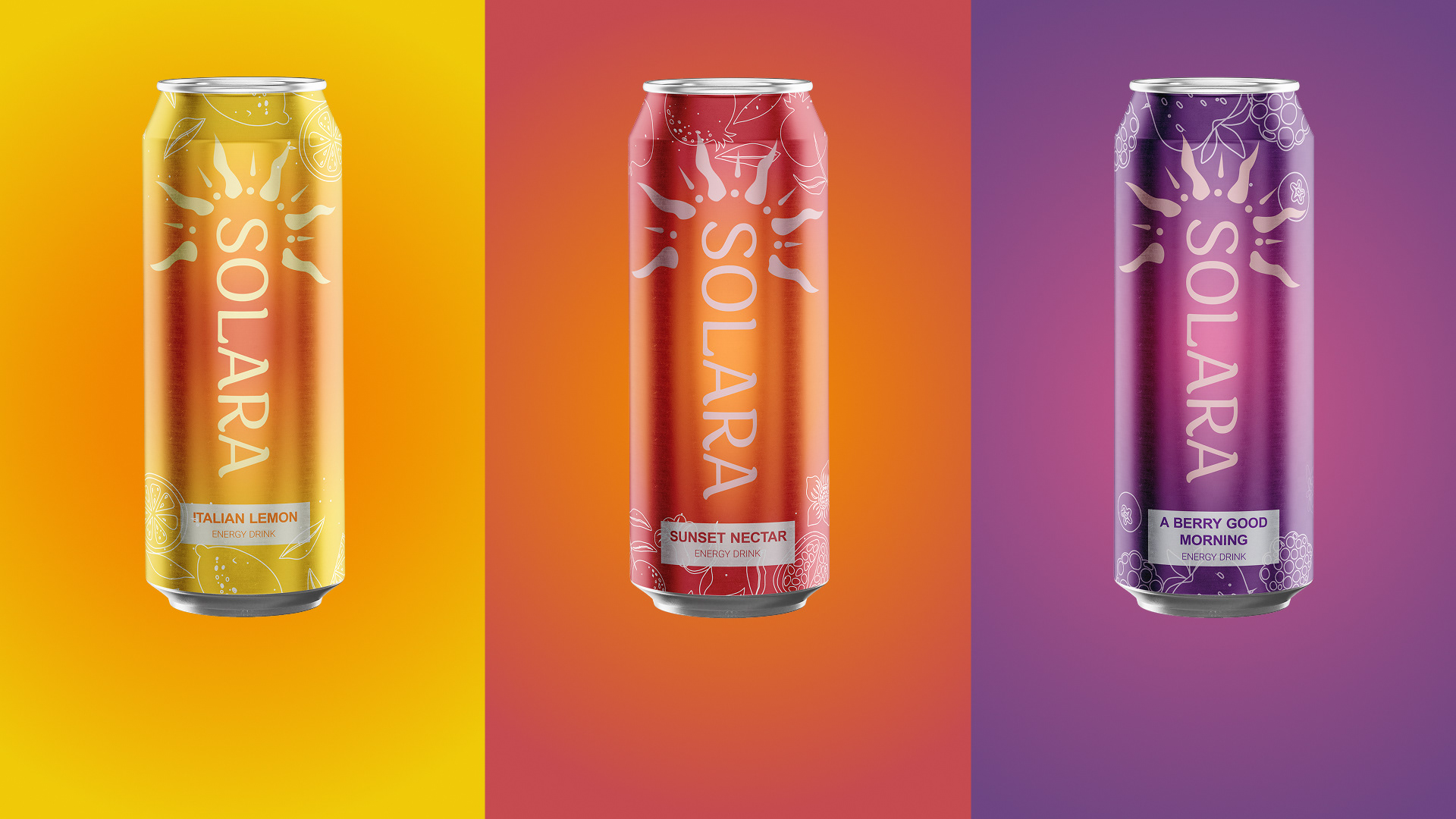
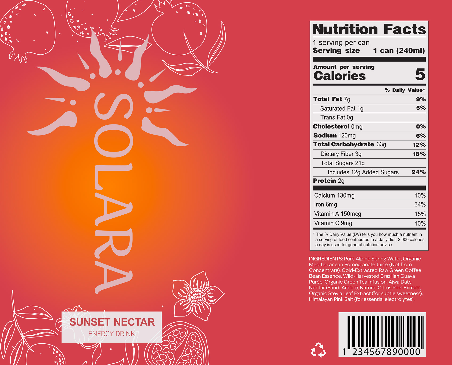
Solara is a concept that aligns its identity with the shifting landscape of the energy drink industry, and capitalizes on this by utilizing natural ingredients and maintaining a sustainable brand image. The name means “of the sun”, giving the sense of nature, power and prestige.
Throughout the timeline me and my team had weekly and online check-ins to see measure our progress, and create milestones to reach. At the time we were all managing several projects at once, but our effective time management, and consistent communication allowed us to reach the deadline before the due date.
Working in this team was an overall great experience and we overcame many challenges, arguably the biggest hurdle was choosing the final product design, as we all started in different directions. To solve our problem and avoid conflict, we chose incorporate our teammates design choices in further drafts. This created great synergy among the group, and created feedback loop that ultimately culminated into product concept we could all agree aligned with our brand identity.

Process
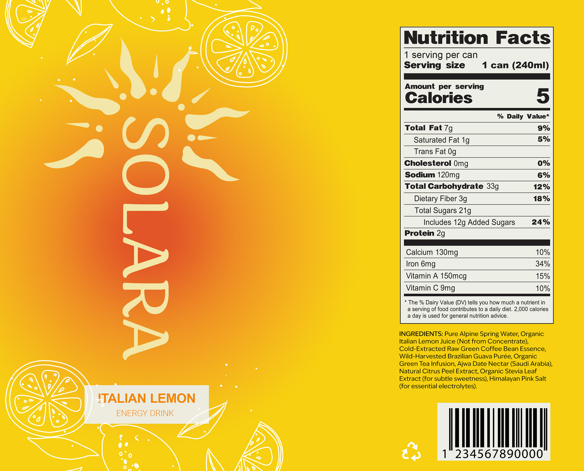
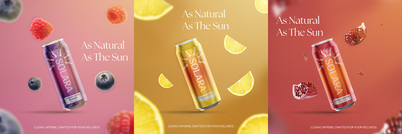
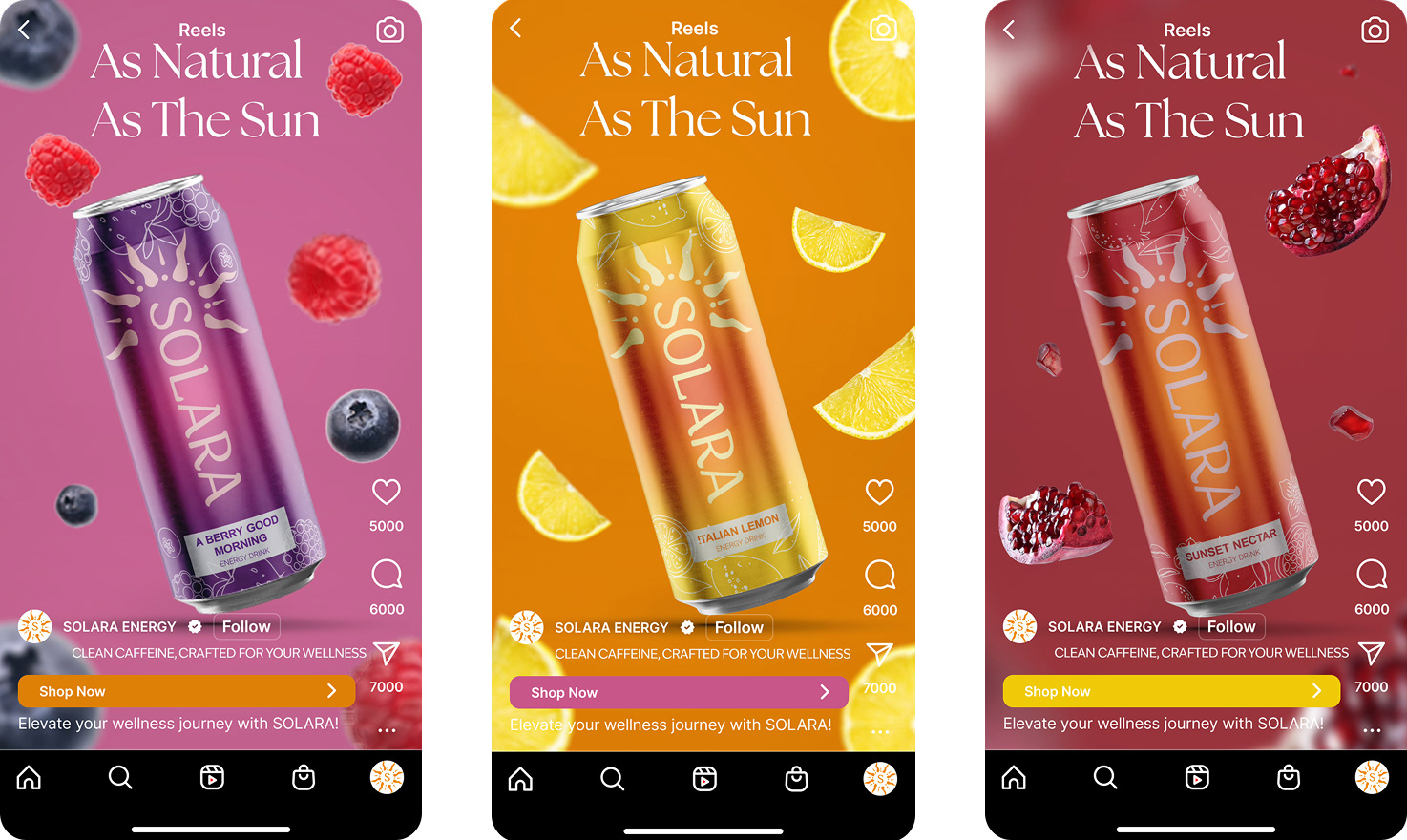
I primarily worked on the print marketing collateral, consisting of 8x8, 8.5x11 posters and a billboard. For the advertisements I aimed to have the drink be centered, while the ingredients surrounded the drink. I utilized whitespace as this is often seen in other luxury and high fashion marketing.
To create a sense of depth, fruits closer and further away from the drink were larger with more intense field blur, whereas close to the drink they were clear and in focus. Creating a sense of movement as the fruits look like they’re falling. For more depth and better alignment with our brand image I added a ray of sunlight hitting the drink from a downward angle.

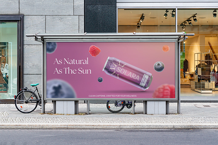
Billboard
For the billboard I rearranged the fruit in the same positions within the new dimension, and due to constraints the drink was sideways, this however worked in our favour as the tagline was on the left allowing for a seamless transition into the drink.
The tagline “As Natural As The Sun” was complemented by using The Seasons typeface, as it exuded the elegance the brand was going for.
Our team as a whole was able to execute the requirements earlier than expected, and we were able to cultivate a positive work environment. For future group projects I would implement the group reiteration process again as it was major factor in our ability to communicate, decide, and execute.
The brief emphasized the necessity for a healthy, sustainable brand identity, all components of this concept integrated that idea, from the name, colours, logo, and marketing collateral.
If I could change one thing it would be to add water flowing in advertisements, to create a greater sense of movement and to better guide the audiences eyes through the ad. As a result for the berries and lemon posters I would remove 2 fruits to prevent from cluttering the page.